Saturday, 28 September 2013

Analysing Magazine Advertisements

Alongside my music video and digipak, I have also been asked to create a magazine advertisement for my artist's new album. To be able to create my own I need to identify the typical conventions of a music magazine advert and what information needs to be displayed. 
There are the obvious features such as artists name to make it clear who is being advertised, the album name to show what is being advertised. There is always an eye catching image, whether it be of the artist or a unique conceptual image, this not only shows us who the artists are but also gives an indication to the genre and artist style. A release date is often shown to highlight when the audience can get hold of the album and quite often ways of downloading the album/song to show where and how the audience can get hold of the music, making it easy will increase sales.  Song featured in the album is also common, often well known, chart music to get the audience hooked into why they should go away and buy the album/song, along with the new album cover to show what they can buy, also if its easily recognisable when they see it in shops they will be inclined to pick up a copy. Websites are often added to an advert to make it easy for an audience to know how to find out more, also to create a further possibly interactive relationship between artist and audience. Quite often an artist will have a certain font or logo that they are associated with, this helps an audience identify who the artist is and learn more about their style/genre. Occasionally the record label will have their logos printed small onto the adverts to build up artist profile, and audience can see who represents them and others they are associated with.


This advert for Marina & The Diamonds meets many of the typical conventions; artist name, album name, eye catching image, featured songs, album cover design and where to download.  The colour of the advert is a greeny, brown colour, retro style lacy patterns which portrays the artists style. The over all design is very simple, with a striking close up of the artists face looking into the camera, and the use of white text. The magazine advert overall looks as if a sepia affect has been used to keep the retro theme. The target audience for this artist is predominantly teenage girl, accentuated by the girly lipstick font, and also the pink colour of her 'new single' which matches the pink on the album cover, helping to carry through a consistent design which is easily recognisable in shops or itunes etc. She is your typical pop genre, meeting many of the conventions; she looks glamorous in the image, therefore her target audience aspire to be like her, there is a fun creative font aimed at her younger audience, and also the advert is focused on her, helping to create this artist persona, putting a face to the name.  


Jessie J's magazine advert also meets many of the typical contentions, her name, album name, eye-catching image, hit singles, guest star/s, her own website and also logos of record labels. The advert itself if very striking, with the uses of black, white and gold. She is easily recognisable with her signature black bob with block fringe, matching with her dark clothing, makeup and nail varnish. The close up of her looking face on into the camera takes up the top two thirds of the advert, making it fully focused on her, and being her debut album it also helps to create a strong, fierce artist persona. The bottom third of the advert is taken up with the important information needed in the magazine like the album name, hit singles, website and record labels, these stand out well from the black background with the uses of white and gold and also a very simple 'caps' font so it is therefore bold and easy to use. Her name is pasted across the image of her in her signature font, also in gold to keep the typical genres of wealthy and powerful, which links well with her strong image. And by showing her website address fans can create a further relationship with the artist, finding out more about her, helping to create loyal fans. 


Although Wretch 32's magazine advert is similar in many ways to the other two, it is also very different. Firstly the conventions are similar with the artist name, album name, release date, guest stars, album cover, website, record labels and where you can download/buy it from. However the over all design is very different. He isn't looking directly into the camera, indicating that the album isn't going to be as dominant as the others, perhaps a more laid back, emotional approach and features a mid shot rather than just head shot. It is edited in such a way that the over all effect is of street art, with abstract birds in the sky, portraying a sense of freedom and emotion, built up buildings to show he is a rapper from the streets helping to bring out his genre. His name in the top right hand corner is written in a graffiti style which links well with the running paint coming off his neck and the buildings. Wretch still looks very powerful, centre of the advert appearing larger than the buildings with his heads in the clouds with the birds, although his outfit is very simple we can still see chains and jewelry in his hand to emphasise his wealth and success as an artist but also show his true city boy background. The advert is made easy to read by the black banners across the image which are showing key information written in a clear white font, standing out from the image so the important information isn't missed. The advert appears to be very similar to the album cover which we can see in the bottom left corner, helping to clearly link the two and make it easily recognisable from the places listed on the bottom right of the advert. His MySpace address is also shown, meaning fans can build up a further relationship with the artist on a social network. 

Friday, 20 September 2013

Treatment for ‘Cloud 9’ by Ms Dynamite ft Shy FX

I have been doing a great deal of research towards my music video, analysing music videos, thinking about how they relate to lyrics and target audience, and other videos within this genre. Based on the research, these are my initial thoughts for my music video:

The narrative for my video I would like to cut between a variety of scenes, for example, I will have a female artist strolling through a field, also walking along a beach, swimming in a pool, singing into a microphone etc. I will have images showing the artist thinking about something/someone that is making her happy (on Cloud 9!) This links well with my mise-en-scene, it will be set on beaches, fields, very outdoors, also I would ideally like to have the sun shining and use high key lighting, making it look summery linking to the summery feel to the song. I would like to include old cars and buildings to have the contrast between aspirational locations and a run down, less materialistic approach.

Possible props like an iPod, phone or another device in which my artist will be listening to music on, singing along to the music, lip syncing with the background music. She will also be wearing sunglasses to emphasise the summer season, also summery clothes will be worn by my model, loose trousers, shorts, crop tops, long dresses etc. I hope to include various special effects, such as slow motions, fast paced editing, fading between scenes, however I want to keep it fairly natural looking and realistic.

Various cinematography techniques will be used, I will have long pans across beaches and fields to show locations, close ups of the artist lip syncing along with the music and also to show emotion on the actors face. I also plan to use high angle shots to make the actor superior, on top of the world, on 'Cloud 9'.

My star persona will be fun, laid back, very happy, fashionista, who my female target audience can connect with. I want to create the effect of a dream, peaceful and calm, cutting the shots in time with the beat of the music, flowing as if the audience is dreaming, imagining this 'Cloud 9' feeling.

My music video will meet many of the genre conventions including aspirational locations, cheerful, bright colours and the appearance of a laid back lifestyle. I want my music video to also be upbeat, fun and summery, capturing the Caribbean way of life. But going against genre conventions I won't be sexualising women, or portraying materialism.


Monday, 16 September 2013

Analysing Digipaks

Alongside my music video, I also have to create a digipak, I have started to explore some contrasting digipaks which include the front and back covers of the booklet, the back of the album and the CD design.

Major Lazer - Guns Don't Kill People... Lazers Do


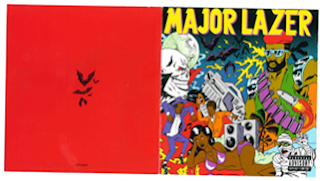
This booklet/album cover is very typical to Major Lazer, using their cartoon style which links with their music videos as well as their genre. The colours used are very bright and fun which work well with their Reggae/dance/electronic genre. The cover implies fast, upbeat music which is exactly what it is, we get this from the crowded, layered look it has. All of these aspects appeal to the target audience of young modern reggae lovers because they are looking for hyperactive, loud, dance music which is expressed by the use of bright colours and also the cartoons; your typical Major Lazer figure which appears in all of their advertising and marketing, you can also see speakers which implies volume, lightening; you can imagine being in a club with flashing lights, bats and a full moon which implies night time - Party time! you can also see a woman in bikini, palm trees, music technology, people dancing; these all fit with the conventions of the genre with beach scenes, loud music and sense of busy crowds! Although the cover is very bright and mad, the main focus is still their name positioned in bright yellow shadowed with purple at the top of the cover. There is also a 'Parental Advisory Explicit Content' label positioned in the bottom right corner which also highlights aiming at the older teenage audience (and perhaps more enticing!). However, the back cover of the booklet is very simple, using an angry red background and some simple black bats in the centre to show that they are very 'after dark'.


The back cover of the album includes what you would typically expect, displaying a list of numbered tracks for the CD inside, along with the CD's bar code, record company and any immediate credits. All of these aspects are positioned on the right side because there is a large image of the back of the Major Lazer cartoon character on the left. The album also has the Extended Play list of songs which attracts the audience, giving them bonus tracks over and above those featured on the usual CD. This helps to keep the consistency throughout, the cartoon really helps to create the artist's persona - Caribbean male, muscular, long dreads, wearing some kind of armor which links well with the album title (Guns don't kill people . . . Lazers do). Attractive to the female audience in a 'knight in shining armour', and appealing to the males because they almost aspire to be this hero, fighting figure. 


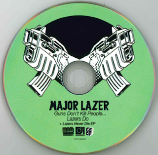
The CD is a mint green colour, linking with the colourful vibe throughout all of their digipak! On the CD is their name, the album name, also in smaller font the EP which highlights that it is an extended version - bonus tracks, record company logos are also shown, all in a consistent font to the one shown on the booklet and album case. Out of the centre there are two large black and white guns which not only link with the title of the album, but help us to see what is expected of the sound of the album; explosive, loud and high energy music!

Conor Maynard - Contrast 


The booklet cover and back are both very similar, both featuring an image of the main artist centred. Because he is quite a new artist (and considered eye-candy to some!), he features heavily on the marketing to get his face linked with his voice, but also because he is a solo artist, the album is very focused around him individually. The images are clearly very professionally stylised, studio based on a plain white background - more focus on him! He is dressed in a smart casual fashion, smart shirt and tie, with the contrast of bright red trainers, this shows his age that he still likes to have fun and also maybe into sports (attracts girls and relates to boys), however dressed smartly to show that he is serious about his music. Because he is a pop artist, and has a predominately teenage girl target audience, the main focus is the look of the artist and not necessarily an indication of the type of music. There is a banner across the centre of both the front and back of the booklet with his name and the name of the album, it is transparent so you can see the image underneath; more focus on him! Although his name is in a plain white, the name of the album is in a bright yellow linking with the album name of 'contrast' because it is literally a contrast with the mainly black and white image. 


The back of the album includes the list of songs included on the album, also in the same font as the booklet to keep consistency. There is also the constant black and white theme which works well with the idea of 'contrast', smart and classy, maturing the artist although only young, however he has a little cheeky pose to emphasis his age; 'man about town'. The bottom left is filled with a bar code and also the immediate credits of the album as the whole right side of the album is taken up by the large image of the artist. 


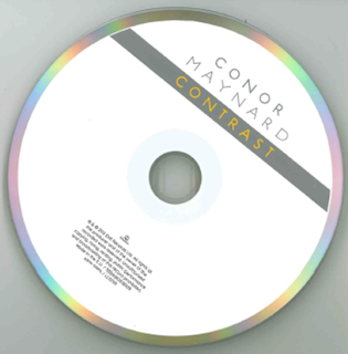
I really like the simplicity of this CD design, especially the outer rim of the CD with the use of an array of rainbow colours which 'contrast' well with the overall black and white theme throughout. The colours also contrast with the simple white background and the artists name written in the same simple font in grey, then a banner with the album name written in bright orange, which also links the cover with the CD design. At the bottom of the CD it features the small record label logo and the immediate credits of the album in very small font, making sure the artists name and album name are the most important part.

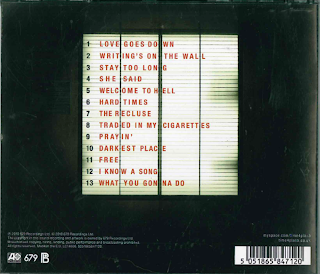
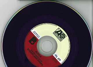
Plan B - The Defamation Strickland Banks


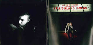
 I really love the way that this album has been designed in the style of an old style movie theatre. Plan B is an already established artist therefore people can already put a face to the name, so they have used shadows, hiding parts of him, portraying a sense of mystery, not knowing what to expect from the album, hooking the audience making them want to find out more. Although he is in shadows, he is still predominantly lit by a spot light, making him the main focus, being a solo artist, all attention is on him. On the front he is sat on the theatre stage, showing he is the performer in the spotlight, however instead of looking out into the audience he is looking down thinking, implying the album is going to be emotional and meaningful. At he top you can see his name and album name in lights, just like outside of a movie theatre, written in red which is a nice contrast with the predominant dark and white mysterious style of everything else, portrays trouble, possible anger or love, more implications of an emotional album inside. 


Linking well with the movie theatre theme, the song numbers and names are also written in a lit up board much like the movie theatre ones in the same red font as the front of the album, central to the back of the CD. The background is black, helping to make the songs the main focus. A bar code is situated on the bottom right hand corner, whereas the record label logos and main credits are on the bottom left hand side in white text. Everything is in simple black and white, except the song names in red, drawing more attention, showing he is focusing on his music. 


I really love the CD design because it stays with the old fashioned theme, as the CD is in the style of an old vinyl record, a classic. This implies that his music is timeless, to be enjoyed for a long time, retro theme possibly attracting an older audience or people who enjoy old music. The artist name and album name is written in a simple black text central bottom, as well as various record label logos and other credential logos around the inner ring. 

After analysing these and other digipaks there are common features which are included -   artists name to make it clear who is being featured and the album name. There is always an eye catching image, whether it be of the artist or a unique conceptual image, this not only shows us who the artists are but also gives an indication to the genre and artist style.  A track list clearly showing what the album includes. Websites are often added to make it easy for an audience to know how to find out more, also to create a further possibly interactive relationship between artist and audience. Consistent use of font and/or logo throughout the pack to help an audience identify with the artist and learn more about their style/genre. The record label logos are printed small so the audience can see who represents them and others they are associated with. Bar-codes are mostly included along the bottom, so people can easily buy albums in retail outlets. 
Mainly the CD itself is a much simplified version of the design but of a consistent design feel.

Thursday, 12 September 2013

Lyrics Analysis

Ms Dynamite & Shy FX - 'Cloud 9'


So high so high, i don't wanna come down
i don't wanna come down
so high so high, i don't wanna come down
i don't wanna come down
you get me high high high so high that i don't wanna come down

its our game, after all this time baby, i have no doubts
our game, im only yours, i keep running out
no no no no

you got it and you make me feel, make me fly, make me fall
so you've got it with that love so real
you make me cry, you make me crawl
you've got it with the sweetest touch
the sweetest lips, the sweetest tone

you've got it with the..
you got it you got it you got it
you get me high high high so high that i don't wanna come down
so high so high, i don't wanna come down
i don't wanna come down
so high so high, i don't wanna come down
i don't wanna come down

you, you got to know you're my everything
and its another thing to do,
to make me wear your ring, you're my king
oh yeah yeah yeaaaaaaah ay

you got it and you make me feel, make me fly, make me fall
so you've got it with that love so real
make me cry, make me crawl
you've got it with the sweetest touch
the sweetest lips, the sweetest tone

you've got it with the..
you got it you got it you got it
you get me high high high so high that i dont wanna come down


So gimme gimme that gravity 
Set my soul on fire
Now gimme gimme that gravity 
You're making me higher
Now gimme gimme that gravity 
Set my soul on fire 
Now gimme gimme that
Cos you got it you got it you got it

After looking at the lyrics I believe Ms Dynamite is singing about lover/boyfriend referring to him as her 'king' and 'baby'. The song is saying that this guy is metaphorically making her 'high' referring to the envious, relaxed state possibly caused by taking drugs. Implying that the love of this man is like taking drugs, she is addicted and dependent on him. She says that she is so high and happy with this guy, that she doesn't want to come down, she doesn't want it to end.

She compares their relationship to a 'game' indicating fun, and both challenging and rewarding. She also has 'no doubts' about their relationship and 'after all this time' implying they have been together a long time and she is serious by saying 'I'm only yours', she is looking no where else, and is serious about him.

He makes her feeling like she's both 'flying and falling, crying and crawling', however she refers to their love as 'real', him making her feel a rollarcoaster of emotions with his 'sweetest touch', 'lips' and 'tone'.
Ms Dynamite refers to him as her 'everything' possibly linking with the dependence of drugs, and says is 'another thing to do', to make her wear his ring. Saying that the next step is engagement, marriage showing how serious she is about him wanting to spend her life with him. Also referring him as her 'king', she looks up to him, respects and thinks the world of him.

She is asking him to give her 'gravity', so commitment, linking with marriage, saying how he sets her 'soul on fire' and is 'making her higher'. She is very clearly head over heels with this man, ending the song with the line 'you got it, you got it, you got it', although we don't know what 'it' is, we can guess she is implying this guy is the full package and has everything she wants from a man as she is serious about marrying him.

The song is very positive, she talks a little bit about their highs and lows, but always linking the verses back to him making her 'high', referring to being on 'cloud 9' high in the sky. Cloud 9 is heaven, the utopia of pleasure, a state of being in love and also the feeling described whilst being under the influence of drugs. 

Sunday, 8 September 2013

Inspiration Mood Board

To start gaining some ideas for my music video, I have gathered some pictures together to create a mood board, which shows some of my initial ideas for location, imagery etc - blue skies, beaches, brass instruments, recording studio, exotic cocktails, fused with English countryside and plenty of clouds!


Wednesday, 4 September 2013

Final song choice

After some careful consideration, I have reevaluated my shortlist of potential songs. I have taken into account the asks of my target audience and also a song that has meaning to me. However the biggest deciding point is how I will create a music video to accompany this.

I have decided to go with 'Cloud 9' - Ms Dynamite & Shy FX, firstly because I really enjoy the song.. Which is pretty important seeing as I'm going to have to listen to the song many times while creating my music video. I also feel that it meets the criteria of my target audience as it is a summery fusion between Reggae and R&B! Because the song is still yet to be released (23rd September), there is no music video to accompany it. This means there is a wide variety of directions I could take it, meaning there would be no ideas from an existing music video and I can make it fully my own! The song emits summery, happy, positive vibes which will be enjoyable to create a music video for.

I am currently on holiday at the moment and after being among palm trees and beaches, it has really inspired me to want to create a summery music video including aspirational locations like beaches and swimming pools. I understand because of the time of year we will be shooting the footage in it may be difficult, but it just so happens that I have had my video camera handy and have started capturing some material which I hope I can use in my final edit. Although I haven't planned my story board, the images I have taken have been inspired by the music and will hopefully give me some further ideas for shooting other aspects of the video. I hope when shooting the rest of the footage, that with the right lighting and an Indian summer back in the UK I can create the summery vibe I am hoping for.