Alongside my music video, I also have to create a digipak, I have started to explore some contrasting digipaks which include the front and back covers of the booklet, the back of the album and the CD design.
Major Lazer - Guns Don't Kill People... Lazers Do

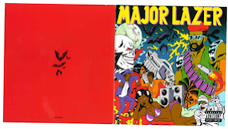
This booklet/album cover is very typical to Major Lazer, using their cartoon style which links with their music videos as well as their genre. The colours used are very bright and fun which work well with their Reggae/dance/electronic genre. The cover implies fast, upbeat music which is exactly what it is, we get this from the crowded, layered look it has. All of these aspects appeal to the target audience of young modern reggae lovers because they are looking for hyperactive, loud, dance music which is expressed by the use of bright colours and also the cartoons; your typical Major Lazer figure which appears in all of their advertising and marketing, you can also see speakers which implies volume, lightening; you can imagine being in a club with flashing lights, bats and a full moon which implies night time - Party time! you can also see a woman in bikini, palm trees, music technology, people dancing; these all fit with the conventions of the genre with beach scenes, loud music and sense of busy crowds! Although the cover is very bright and mad, the main focus is still their name positioned in bright yellow shadowed with purple at the top of the cover. There is also a 'Parental Advisory Explicit Content' label positioned in the bottom right corner which also highlights aiming at the older teenage audience (and perhaps more enticing!). However, the back cover of the booklet is very simple, using an angry red background and some simple black bats in the centre to show that they are very 'after dark'.

The back cover of the album includes what you would typically expect, displaying a list of numbered tracks for the CD inside, along with the CD's bar code, record company and any immediate credits. All of these aspects are positioned on the right side because there is a large image of the back of the Major Lazer cartoon character on the left. The album also has the Extended Play list of songs which attracts the audience, giving them bonus tracks over and above those featured on the usual CD. This helps to keep the consistency throughout, the cartoon really helps to create the artist's persona - Caribbean male, muscular, long dreads, wearing some kind of armor which links well with the album title (Guns don't kill people . . . Lazers do). Attractive to the female audience in a 'knight in shining armour', and appealing to the males because they almost aspire to be this hero, fighting figure.

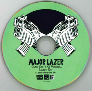
The CD is a mint green colour, linking with the colourful vibe throughout all of their digipak! On the CD is their name, the album name, also in smaller font the EP which highlights that it is an extended version - bonus tracks, record company logos are also shown, all in a consistent font to the one shown on the booklet and album case. Out of the centre there are two large black and white guns which not only link with the title of the album, but help us to see what is expected of the sound of the album; explosive, loud and high energy music!
Conor Maynard - Contrast

The booklet cover and back are both very similar, both featuring an image of the main artist centred. Because he is quite a new artist (and considered eye-candy to some!), he features heavily on the marketing to get his face linked with his voice, but also because he is a solo artist, the album is very focused around him individually. The images are clearly very professionally stylised, studio based on a plain white background - more focus on him! He is dressed in a smart casual fashion, smart shirt and tie, with the contrast of bright red trainers, this shows his age that he still likes to have fun and also maybe into sports (attracts girls and relates to boys), however dressed smartly to show that he is serious about his music. Because he is a pop artist, and has a predominately teenage girl target audience, the main focus is the look of the artist and not necessarily an indication of the type of music. There is a banner across the centre of both the front and back of the booklet with his name and the name of the album, it is transparent so you can see the image underneath; more focus on him! Although his name is in a plain white, the name of the album is in a bright yellow linking with the album name of 'contrast' because it is literally a contrast with the mainly black and white image.

The back of the album includes the list of songs included on the album, also in the same font as the booklet to keep consistency. There is also the constant black and white theme which works well with the idea of 'contrast', smart and classy, maturing the artist although only young, however he has a little cheeky pose to emphasis his age; 'man about town'. The bottom left is filled with a bar code and also the immediate credits of the album as the whole right side of the album is taken up by the large image of the artist.

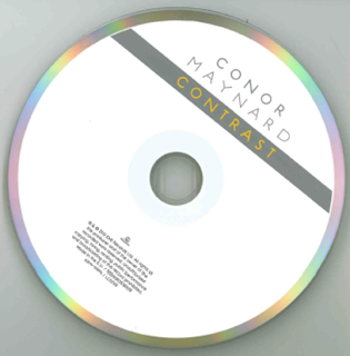
I really like the simplicity of this CD design, especially the outer rim of the CD with the use of an array of rainbow colours which 'contrast' well with the overall black and white theme throughout. The colours also contrast with the simple white background and the artists name written in the same simple font in grey, then a banner with the album name written in bright orange, which also links the cover with the CD design. At the bottom of the CD it features the small record label logo and the immediate credits of the album in very small font, making sure the artists name and album name are the most important part.
Plan B - The Defamation Strickland Banks

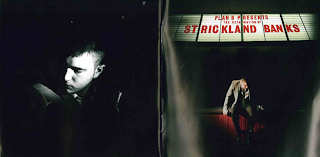
I really love the way that this album has been designed in the style of an old style movie theatre. Plan B is an already established artist therefore people can already put a face to the name, so they have used shadows, hiding parts of him, portraying a sense of mystery, not knowing what to expect from the album, hooking the audience making them want to find out more. Although he is in shadows, he is still predominantly lit by a spot light, making him the main focus, being a solo artist, all attention is on him. On the front he is sat on the theatre stage, showing he is the performer in the spotlight, however instead of looking out into the audience he is looking down thinking, implying the album is going to be emotional and meaningful. At he top you can see his name and album name in lights, just like outside of a movie theatre, written in red which is a nice contrast with the predominant dark and white mysterious style of everything else, portrays trouble, possible anger or love, more implications of an emotional album inside.

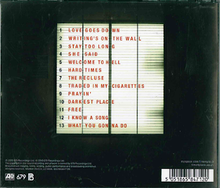
Linking well with the movie theatre theme, the song numbers and names are also written in a lit up board much like the movie theatre ones in the same red font as the front of the album, central to the back of the CD. The background is black, helping to make the songs the main focus. A bar code is situated on the bottom right hand corner, whereas the record label logos and main credits are on the bottom left hand side in white text. Everything is in simple black and white, except the song names in red, drawing more attention, showing he is focusing on his music.

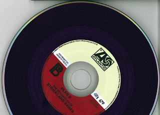
I really love the CD design because it stays with the old fashioned theme, as the CD is in the style of an old vinyl record, a classic. This implies that his music is timeless, to be enjoyed for a long time, retro theme possibly attracting an older audience or people who enjoy old music. The artist name and album name is written in a simple black text central bottom, as well as various record label logos and other credential logos around the inner ring.
After analysing these and other digipaks there are common features which are included - artists name to make it clear who is being featured and the album name. There is always an eye catching image, whether it be of the artist or a unique conceptual image, this not only shows us who the artists are but also gives an indication to the genre and artist style. A track list clearly showing what the album includes. Websites are often added to make it easy for an audience to know how to find out more, also to create a further possibly interactive relationship between artist and audience. Consistent use of font and/or logo throughout the pack to help an audience identify with the artist and learn more about their style/genre. The record label logos are printed small so the audience can see who represents them and others they are associated with. Bar-codes are mostly included along the bottom, so people can easily buy albums in retail outlets.
Mainly the CD itself is a much simplified version of the design but of a consistent design feel.


.png)


